
11 Ideas That Can Help You Make Your Website Great!
June 28, 2017
What Does It Take To Design A Great Logo?
July 6, 2017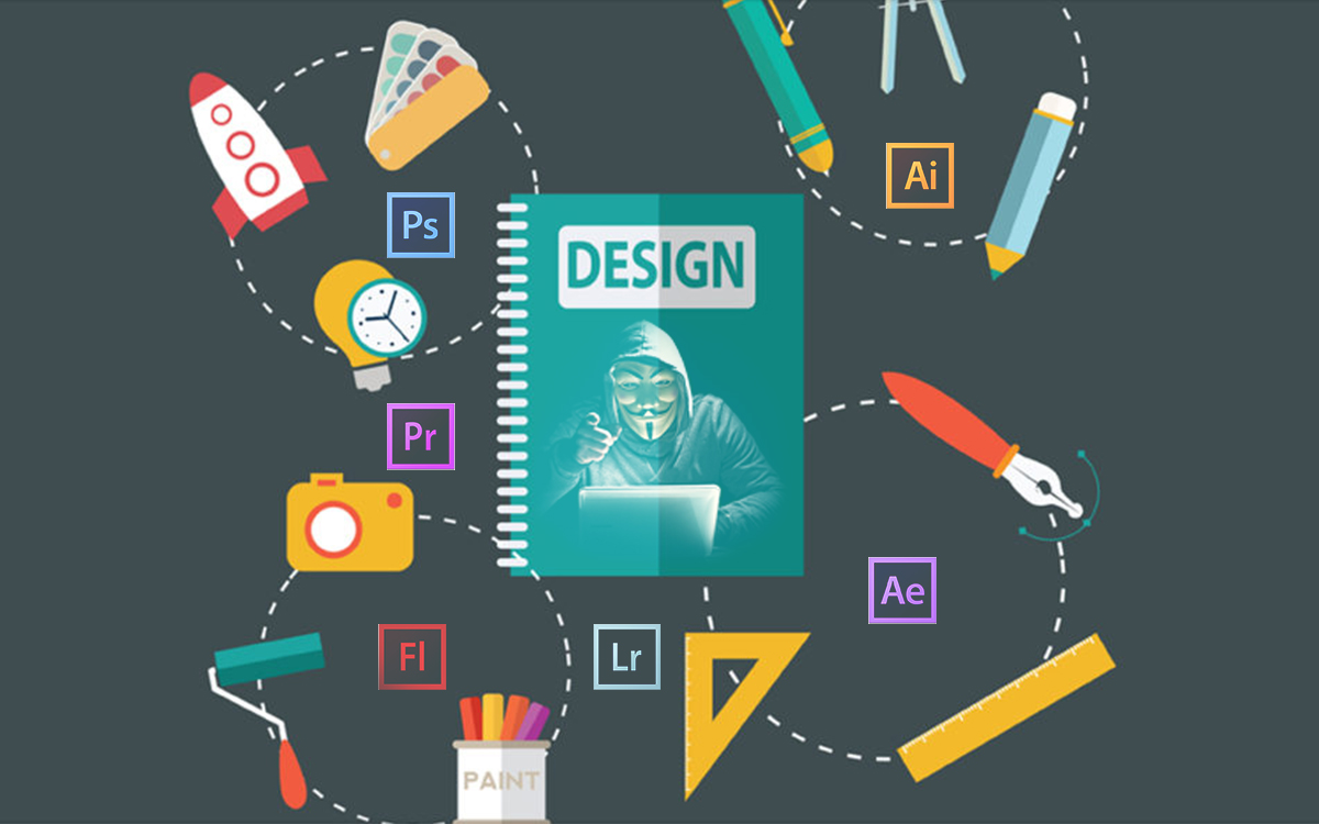
Did you ever think something like this when designing an image?
” If I had a bit more expertise, I could have made this image even more INCREDIBLE!”
Well, if that’s the case, you need not worry. Almost every other designer goes through that at some point!
Sometimes, just knowing a few hacks and tips can go a long way in ensuring that you end up with the best design possible and realize your full potential as a designer and creativity. Even if you don’t feel that your skills are up to par yet, you can enhance your creativity by being a bit smart and utilizing a few techniques in your favor.
Graphic designing is not just a game of creating the best design possible. You must also know and research into new and better ways by which you can improve your designs and aptly create the wow factor. As a graphic designer, you may be tasked with creating event posters, blog images and annual reports, innovating big-picture campaigns, slogans, and ideas and you would need the right tools for them but not knowing some of the key factors pertaining to graphic design can land you in a lot of trouble.
The moral of the story is that to make yourself proficient in the matters of graphic design, you need some design related hacks to be on your tips. Gratefully, you don’t have to obtain a design degree or take some extremely advanced course. With some simple hacks, like the following ones, you can up your graphic designing game in no time at all.
To solve your problems, here is a taste of some of the most powerful graphic design hacks we have compiled:
1- Pair Contrasting Fonts
Combination of fonts is one of the most common areas that stumps people who are starting out with graphic design.
A great rule of thumb is to choose fonts with high contrast. This will help the fonts balance each other out while still creating a feature in your design.
2- Matching Colors Within Your Designs
Creating color harmony is one of the most effective ways to make your designs stand out.
One way to create harmony is to match the colors you use for your graphic elements — such as fonts or text holders — with a background image.
You can find the exact color from an image using a color picker tool, which will provide you with a hex code — the six-digit code that identifies an exact color on the color wheel.
3- Using Grids for Your Images
Grids can help your layout & edit your images so to create professional effects.
Grids are a really fast & easy way to create your own world class layouts without using design templates.
4- Add Transparent Icons
Whether you’re using an image as a background or a series of colored shapes — there are endless ways to test!
In the example above, a slight transparency was applied to the leaf icon & the background image was darkened to make the text more legible.
5- Exemplify Information with Shapes & Icons
Many people are surprised at how much they can accomplish using shapes & icons.
From creating informative infographics to a unique text holder, this is an important skill which helps you think outside the box & create original designs.
Shapes & icons are great tools to use when creating interesting & informative social media posts, or if you want to wow your boss during a company presentation.
6- Fix Color Issues in Your Images
Making sure your images look their best is an essential part of the graphic design process.
One way to do this is to increase or decrease the saturation of an image. Saturation refers to the intensity of color in an image.
When a color is fully saturated — it appears vivid & bright!
Increasing saturation will make the colors in your image appear richer, while decreasing it will made them look washed-out & muted.
7- Crop Images to Maximize Copy Space
Copy space refers to empty areas within images.
When searching for background images, look for ones with ample copy space that you can use to overlay text. Or, to create more white space, try enlarging your images.
8- Choose Consistent Elements to Enhance Your Branding
Consistency is one of the important skills brands must master when using colors, fonts, logos & images.
The designs should feature a consistent layout seen through the repetitive placement of text, use of typefaces & color palette.
This helps achieve visual recognition — which is an important element of your company’s communication with the world.
9- Design Visual Assets for Social Media
Along with posting regularly to social media, designing visual assets for elements such as your profile picture & cover image is essential.
Visual principles apply just as much to social media as they do everywhere else.
10- Design Themed Presentations
Do you need to create presentations at work or school?
Great design can help your ideas stand out & read effectively — improving your ability to become a great communicator.
In the slides, the layout, use of fonts & photo filter should all be applied consistently.
Changing the size of the text also helped create typographic hierarchy, which refers to the order the text is read.
You can’t become a professional graphic designer overnight. Anyone who claims this is lying. However, by slowly learning new techniques and progressively honing your skills, you can master some of the basics. With this knowledge, you no longer must worry about getting stuck in precarious situations.