
The Top 10 Free Tools You Can Use For Graphic Designing!
July 10, 2017
8 Things That Every Successful Graphic Designer Is Always Doing!
July 17, 2017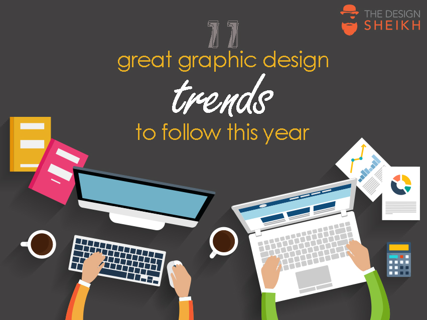
More than the patterns that arise from the Popular feeds, design trends can be an enigmatic thing. They’re influenced by many factors such as culture and media of the past and present, technology, fashion, and other industries. They come and go, but it’s hard to say precisely when. Perhaps, the way to go is to create a blend of modern and in trend designs with old designs that have become outdated. If used appropriately, this can prove to be a lethal combination.
A popular misconception about trends is, that they simply emerge and magically materialize, eventually vanishing off later. But, often, this is not the case. It takes time to peak and you may have seen many of them in one form or another during the last couple years.
However, following trends just for the sake of being trendy usually isn’t a good idea. If you do decide to try a trend, make sure to bear your client’s requirements and preferences in mind so that it’s a good fit for your project and audience. You don’t want a perfectly crafted design to fall short of expectations simply because it doesn’t satisfy a few requirements.
As a designer, even if you’re not keen to follow the design trends, being aware of the shifts going in your industry is always advisable— so that you can be wary of them once they become overused, or twist them into something new and interesting. Here are the 11 best design trends that you must look out for to get inspired this year:
1- Modular Layouts
Modular or card-based layouts have been adopted by some of the biggest brands for their websites and mobile apps. But organizing designs (of all mediums) according to a grid is nothing new.
It’s the self-contained modules or cards used as the primary organizational principle that has created the twist of a new trend.
2- Bold Typography
In 2017, bold typography will also combat the ever-declining attention spans of readers, and the overload of content. Big and daring fonts will be used to grab the eye.
One of best favorite examples of this would have to be Wired. They use a mix of fonts to highlight individual titles and establish a hierarchy of information on the page.
Additionally, the shift to mobile and extremely high definition screens will also increase the need for bold fonts. Obviously, more and more people will be using their phones to get content, and the way that content is presented will need to keep up.
3- Responsive logos
Responsive logos have been designed to keep up with the expanding selection of formats and scales available to users. Scaling down for mobile phones doesn’t just mean making things smaller, a good logo will respond to its environment and still be functional. Responsive logos are simple and malleable. With more smart devices with different forms available each day, the responsive logo can only continue to become more relevant in 2017.
4- Cinemagraphs
Cinemagraphs are an incredible, simple and effective answer to one of the marketing’s toughest problem: time. They aren’t the regular gifs we see all around the web. Cinemagraphs are still photographs with minor element moving in them except for a single, minor movement that is made. This technique makes simply photos look more realistic and bring them to life.
As marketers should do and use every possible tool to grab the audience’s attention in a very short and exciting way, cinemagraphs are the perfect tool for doing this. The image will usually come in the form of a GIF. Owing to the decreasing attention spans, marketing must work faster to grab our attentions, and cinemagraphs do just this. With more and more competition between marketers and screen real estate, expect to see cinemagraphs increasingly coming to your screens.
5- Hand drawn images
Illustrated images are best for adding a clearly human element to graphic design. More recently, Illustrations have tended to be simple and evoke a kind of childish and nostalgic feeling. They can be used in a huge range of situations, but are becoming increasingly popular as a way of explaining and illustrating more complex problems or instructions.
6- Contemporary colors
In the past few years, many designers have used safe and easy to digest color schemes, to create very cleaner and controlled designs. We saw many lights and neutral colors like white, grays and black dominating the layouts. But in 2017 we expect bright, vibrant and bold colors. This trend has started earlier in 2016, through a variety of design elements, but it’s expected to really pick up its speed this year. As Pantone crowned the color of the year as Greenery, we expect to see the designers using more colors found in nature and intensifying them. With photography, the trend is to use bold and saturated images.
7- Color transitions
Staying in the same register, the color transitions is one of the biggest design trends right now. Started in 2016 and rising quickly after, this trend is everywhere, from logo to buttons or picture overlays. As some of the big brands decided to change their logos and images from flat color to multi-colored transitions, we are expecting to see more companies adopting this trend, both for print and web design.
8- Pattern and geometric shapes
This trend started in 2016 and seems like it’s here to stay. As flat design was a very welcome addendum to the graphics last year, helping to simplify the visuals and improve user experience, we expect to see it growing and expanding this year.
9- Modular layouts
Breaking up a text and putting it into manageable chunks is a continuation of an old trend but it’s popularity has increased in the last past years. Regardless if we are talking about print or web design, most times, using a long block of text is boring and you risk losing the readers. Especially for the web, the graphic designers have figured out that making the information more manageable makes more people interact with it. The modular design is not just a great management tool, but it also can look professional when it’s done well. We expect to see more modular layouts this year, both in print and web design.
10- Bold photography and sleek text
At this moment, this trend is pretty much a staple in the world of graphic designers, because the mix between bold photography and sleek text communicates a clear message without boring the audience. “Bold and sleek” works very well both for people with a short attention span, as well as for those who don’t want to spend too much time looking for the main information and get straight to the point. If they are done well, the photography and text tend to work together and create some great contrast and brilliant borders, streaming class and excitement.
This combination works great for display ads, social media promotions, and graphics where a small amount of information needs to be displayed instantly.
11- Minimalism
Tracing its roots back to the early part of the 20th century minimalism is as popular today as it ever was. Minimalism’s emphasis on simplicity and functionality has led to is adoption in many brands and design trends. Intentional white space means more breathability and reduced focal points. With its popularity only increasing, it looks like minimalism is here to stay for quite some time.
12- Negative Space
Negative and/or white space is a vital part of any good design. But used strategically, negative space can be an ingenious way to add deeper or double meaning to your designs, particularly for logo and branding projects. Or it can simply help give your composition a more nominal look.
13- Material design
Material design may be the biggest and boldest of the design trends of this year. The core concepts of this trend are “material as a metaphor; bold, graphic, intentional; and motion provides meaning.”
This means the visual aesthetic communicates clearly with the user. By drawing inspiration from real-world materials—particularly paper and ink— the designs are embedded, yet lightweight and minimalistic. Paper is tactile, casts shadows, but is also incredibly flexible, so, designing with these principles in mind, you’re weaving together the fabric of the Internet and add depth to your design.
Once you decide to follow any of these trends, you should bear in mind that even the most exciting trends won’t add anything to your designs if you don’t apply them well.
Do you plan on jumping on board with any of these trends, or perhaps combining them like many of the designs featured here? Or do have any predictions of your own? Let us know in the comments!