8 must follow rules of graphic Design that must never be broken!

8 Great Secrets Of Graphic Designing, Everyone Should Know About!
August 4, 2017
6 Reasons You Should Go For A Professional Graphic Designer If You Haven’t Already!
August 8, 2017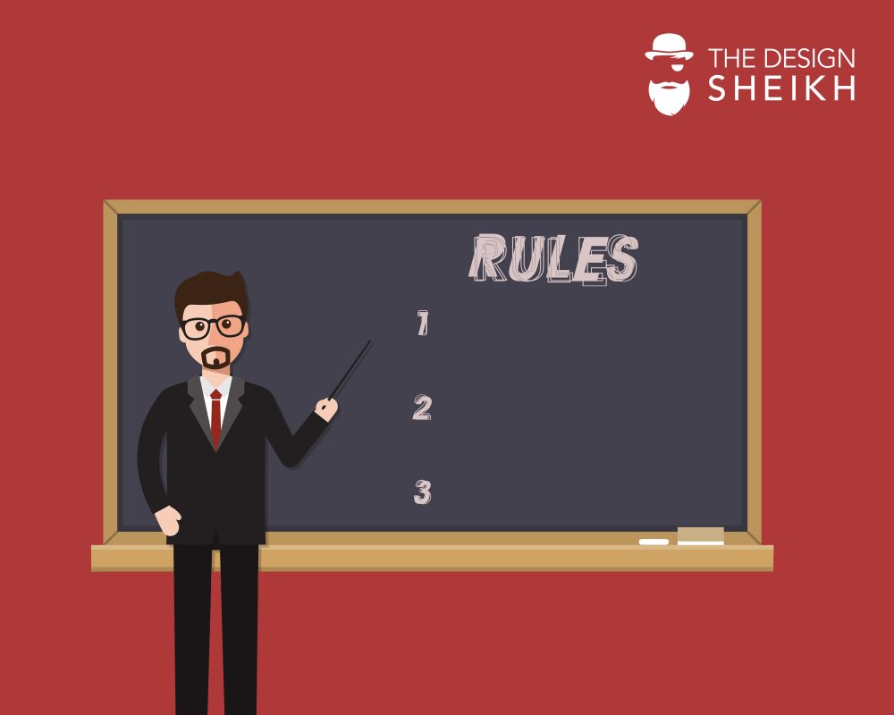
Just like with any other occupation or art, design comes with some rules too. Rules – that are difficult to escape and must be followed always if one wants success in the long term.
Although, it is true that breaking design rules is permissible and even (in some circumstances) encouraged, while some believe the creative process needs not be governed by any sort of rules, it’s important to at least be aware of the rules you may break so you could make the right decision as to whether it would be right or wrong to break them. There is no specific number of rules that one can or cannot break, however we have managed to break it down to 8 common rules, followed by most graphic designers worldwide.
1- Do not trade Readability for Aestheticism
The primary purpose of design is communication, so it makes sense that the readability and legibility of your type must be your top most priority.
The question is, what exactly hampers readability and legibility? Many factors can come into play as to how much effort your reader puts in, just to be able to read it. A common example is too low of a contrast between the text and background, keep contrast high to prevent this issue.
Then comes the issue of the overdoing of capital letters. They make the reader feel like they are being YELLED AT.
Another one is the type size, usually the type that is too small. Considering your audience, you must think about, whether they will have a difficult time reading this type. The point being, just because it looks good, doesn’t necessarily mean it will communicate well.
2- Always Use A Grid
Developing some basic grid skills is perhaps one of the first steps any new designer should undertake. A well-implemented grid can transform your design from something mediocre to something clean, clear and effective.
Grids come in many shapes and sizes and you can build them to be flexible, adaptable and suit your design. Grids help designers align elements on the page in relation to each other often producing a neater, more logical design.
3- Have A Logical Color Palette
Color is a powerful tool for designers, which is why a carefully arranged and consistent palette is an important step in all design endeavors.
When compiling a color palette, it might be worth to consider color theory and the past uses of color. Color theory says that certain hues can certain effects on consumers, i.e. orange is thought to stimulate an appetite, which is why orange is a commonly used in fast food designs.
While experimenting and thwarting expectations might result in a punchy design you must make sure that your use of color isn’t too distracting or complicates your message.
4- Don’t Think Of White Space As Empty Space
White space can really add something special to your design. Smartly used white space can have a great effect on your design. It can help increase the focus on a specific aspect of your composition, it can let your design ‘breathe’, it can help balance out your elements or it can add some sophistication to your design.
It’s pertinent to recognize that the white space is not merely an empty space which is why it does not need to be filled with a graphic or a texture or some type. Don’t disregard the idea of white space, experiment with integrating it into your design and see if it can work for you.
5- Think about Your Medium
It’s very important to know, exactly where your design is going, beforehand. For instance, is it a poster or a website bound within a magazine? Knowing the exact specifications of your design’s application is a very crucial aspect of your design because this is how your design will be viewed. If you cannot account for all the details of the medium you are designing for, you risk your design being compromised one way or another.
6- Start with a good template
A template can be termed as the graphical equivalent to a building’s foundation— which is why you should not begin designing without having one.
Trim size, margins, bleeds, grid, baseline grid, are all things that separate good design from professional design. In the world of web design, they are just as important as anything else.
7- Keep it simple, silly
If something doesn’t have a reason to be there, make it a point to get rid of it.
Simplistic is a design style that doesn’t work for every industry and every client. But that doesn’t mean the design should be complicated or that the design should have things thrown in for no good reason.
8- Your audiences’ opinion matter more
Never justify your design because of your client but rather your audience, who may have a bad taste, do not know anything about color theory, typography, etc. They may not know all the rules, but if they don’t like the design, there’s generally a good reason for it and its your job as a designer to figure that out.
Every designer dreams of having clients who are hands-off, appreciate everything they do and pay them more than they deserve. But the reality is clients are people and people tend to have opinions. Far too many normal clients are considered “bad clients” because probably they had a certain design in mind and your work doesn’t line up with their own ideas.
It’s your job as a designer to guide the client into a design that stands to be as effective as possible.